Zonda`s Quest
More Photos, Less Shop.
Arquivo do autor:zonda525
F@ck the gear?
It`s definitely not the first time I hear this. This time my cousin Elisa (we`ve being talking a lot about photography these days) heard it during her course in the New York Film Academy. One of the instructors said that and she told me during one of our whatsapp talks. Yes, there is a strong movement against the gear headed. It`s a fact, technical knowledge is not enough to produce art. We all get that. As one of these nerds, walking down the creativity path I can suppose I`m in a rather good place to evaluate both arguments and state my own opinion.
(Is it possible that you give me just a moment outside of the formal argumentation so I can scream in a paper bag just how stupid and lazy those so-called artists are when they say that technical knowledge does not matter? Ok…that`s better. Thanks a lot for reading these lines. It was just the time I needed not to start trolling people. You, sir or miss, you are a nice person. Thank you.)
[Draws a deep breath, exhales]
So, let me begin.
There is pleasure in technical knowledge. We, nerds, like to stack as much knowledge as we can. This make us feel good and powerful. In the ultimate sense, we feel like we have control over the subject (in this case, photography). That being the case, it`s not enough for me to know that higher ISO`s will bring more noise to the picture. I want, correction, I need to know why in a mathematical way. Only by knowing that I can feel like I understand ISO. That is, as a person with some sense can figure, overly exaggerated.
Not giving a f@ck about ISO is also exaggerated in another way. Let me illustrate. The Signal versus Noise graph in my camera (Canon 60D) states that from ISO 100 until ISO 800 I lose just a small amount of quality for increasing the ISO, from there until ISO 1600 I lose more, but not a huge amount. From ISO 3200 until 12.800 the quality of the picture plummets, and digital noise is everywhere. It`s not linear! Our so called artist (I`m not trying to create a scarecrow line of argumentation here, I`m just speaking in a general form) probably knew ISO`s and knew digital noise increases with it. Period. I do believe it is relevant to my capability of expression to have the freedom to use a high ISO knowing that I can trade that for a deeper focus. Moreover, knowing how much I`m actually trading in terms of noise.
On a previous post I stated that I gave up buying a Zeiss lens because of its bokeh. On photographic circles, Zeiss Glass is THE glass to have. If you don`t like it, you just don’t know enough about photography. In my humble (and technical) opinion the Zeiss Plannar T* 50mm f/1.4 is not a good lens. Wait. How can a US$ 399 lens be better than a US$ 800 one?
Meet the MTF Graph. The Modulation Transfer Function is a graph to analyze the capability of a lens to express resolution. It is part of a very specific (and not very important) technical aspect of lenses. Once you know it, it`s pretty useful to understand lens issues. If you want to know more, just google MTF Graph and have a blast. Here I`ll just state the essential: the upper and continuous lines are the most important ones as they capture the gross detail that a lens can reproduce. The vertical axis is the capability (from 0 to 100 or from 0 to 1) and the horizontal axis shows the lens from the middle (represented by the number 0) to the extreme corner (represented by the twenty something).
What does our graphs say to us? Lets see the first one:
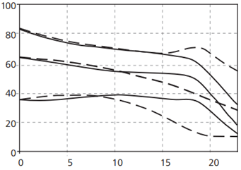
This firs graph shows the Zeiss 50mm at f/1.4. It shows that in the center it captures about eighty something percent of the details and that falls continuously until the corner. Then it drastically falls in the extreme corner. Let`s see what the Sigma 50mm shows:

The sigma begins at 90% and keeps it kind of steady until the middle of the frame. Than it falls rapidly as we move to the corners.
Can someone wake the artist with the hipster glasses, please? Thanks.
The bottom line is: 50mm lenses are used for portraits (oh, you`re awake and already complaining that 85mm are the adequate lenses for portraits? Prove it.). On a portrait usually we want the focus point (the eyes and face, if possible) in focus and a nice and creamy bokeh on the background. Well, the Zeiss gives somewhat sharp centers but it`s capability of render details falls right away. The Sigma, in the other hand allows you to take the picture off the center and still manage to get a sharp focused area.
Now to the bokeh: the Zeiss lens is made with 9 straight aperture blades, in opposition to the 9 rounded ones from Sigma.
Dude! Who the hell cares about the shape of aperture blades? Get a life! I mean, do you have any friends?
You will care about it in a second and we can be friends! Just hold still, we`re almost there!
Straight aperture blades tend to leave a messy out of focus area, with geometrical distractive highlights that takes the attention out of the main subject. The review made by The Phoblographer shows the kind of bokeh the Zeiss leaves you with:

(Picure from The Phoblographer)
In opposition, the review from the same site show what kind of bokeh you get from rounded aperture blades:

(Picture from The Phoblographer)
Both pictures were shot with the same fstop. Two more pictures to illustrate that:


Straight Blades from a 5 straight blades Canon 50mm f/1.8 shot at f/4.5 and the same configuration from the Sigma 50mm f/1.4 9 rounded blades. See the difference?
The story goes on! There`s Chromatic Aberrations, Spherical Residual Aberrations, Vigneting, Distortions, color rendition, color spaces, gamma curves in JPEG and RAW Files and a lot more topics that change the way photography behaves.
Can one really deny, after the examples given, that the lens design in its viscerally boring technical characteristics is relevant to the capability that one has to express its intents as photographer? Can one really say that: “F@ck the way my lens renders the out of focus areas” or “F@ck the resolution my lens has across the frame” and still be called a photographer? What kind of artist are those who couldn’t care less about the characteristics of its own working tools?
Are those things really unimportant or what we really have is a bunch of creative people scared of numbers?
Fake it until you make it…
…or the things we deny so we can make what`s expected from us. That was the main theme of a conversation I had with my cousin Elisa a few weeks ago. We were discussing my attempt to shift creativity (a VERY rare resource within these lands…) towards more pleasing subjects. The constrains attached to commercial photography made Elisa very good at it. She is capable of creating and exercising her expression on top of the demands of the “jobs” she gets.
As one could expect, my path through photography is a bit different. As Natalia, a good friend of mine once said: “one can only give what one has to give”. Well, that being the case, the only thing I have to give are a bunch of feelings, and most of them are not beautiful. – Well, then, Elisa said, do not expect people to “upvote” your pictures if what they see is not pleasing to them. She was, again, right.
The absence of recognition however can be bitter to the tongue. In the other hand, creating something just for recognition ends up in an egoloop that feeds me stuff I like, but do not need.
Honestly, I took some time to make up my mind about this. Since I made Hiding Aces and Domination I`ve been stuck in this matter. I made them both in the same night and got a lot of recognition from the former and almost none from the latter. The bad thing is: Domination was almost an open window to my soul. As I already mentioned, Domination has things I feel covered and expressed by things that made me who I am. Hiding Aces was crafted to be liked. The picture meant nothing to me. I`m sure, however, that a card of hearts hanging in a bottle lighted by warm and cozy light was DESTINED for success. Go figure it…
Once I stopped caring about the “likes” I would get for my work, I started sending probes to see what kind of feeling I could bring back. Just like the old man from Hemmingway`s The Old Man and The Sea, something way bigger than expected came to surface. “You wanted something, here you go, have a blast!”. Some strong feelings of hopelessness came up and the images I would like to capture started coming to me.
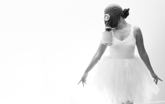
Thankfully, my wife Álica and my very good friend Marcela Nardeli came to the rescue. Some conversation about the main theme came up during the shooting and they tried (and they made it!) to represent it the best way they could without suffocating trough the Russian WWII gas mask I borrowed from my friend Ricardo Roriz. With no more “trying to understand”, I`d like to present you the result of this effort:
Remember

Remember to Breathe


Hunter of light? I think not.
Until now, when asked, I couldn`t answer what I was trying to do when taking pictures. This weekend I was invited to think about it after reading the opinions of a group of photographers that self-proclaimed themselves as “hunters” of light. Each photography is a capture, a prize to be seen.
Once I heard that we define what we are partially by denying what we are not. That is pretty much the case. I couldn`t think of a worse definition to what I do when I press the shutter. While I understand that photography is just means to a greater objective, and while I recognize that the objectives will vary from person to person, the definition of hunter just sounded selfish. Who am I to capture something and call it my prize? What about the characters in the picture?
I went to sleep with that thought, and after dreams about the zombie outbreak, I woke up with my own definition about photography. In my pajamas, I thereby declared that my photography is not about capturing light. Pressing the shutter is about shedding light over true emotions. Once I produced that little and ephemeral reflection of my own self, I seat and hope that someone will identify themselves with it in their own way.
It is not about taking the best pictures in the world! It`s about taking a picture that people can share what I tried to express or, in the worst case, see something about me they don’t like.


Post Facto
Post Facto is the king of light. A great master of colors and composition. Post Facto is a slice of my personality that appears after any creative success. In my head, I imagine Post Facto dressed as one of the ancient Greece philosophers, using a chiton, one of those leather slippers and a beard.
The primary function of Post Facto in what I call my own “self” is to convince me that every success I`ve had was the result of a process that once played backwards would show nothing but pure mathematical logic.
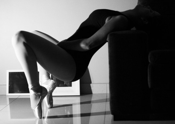
Today I got pissed on that. At two in the morning, about half an hour after shooting Delicate Balance I was entering the shower when Post Facto appeared in what he thinks it`s the Agora (but that in reality is an amphitheater made of my patience):
-
Well, he said, you could see that the chromatic objective of Delicate Balance is to show a gradient that starts on the models legs, filled with light, passing through her body already filled with dark because of the clothes, and ending in full darkness, when her head almost blends with the couch. Another thing we must consider is the balance between the massive solid on the right and the delicate pillars shown by her legs on the left. You really though it through! Congratulations!
No, I did not.
I saw the pose in a picture from Playboy. While I liked the pose, and the theme, I thought I could do it without the nude and creating an alternate interpretation to it, with light and a different angle.
During the shooting, however, I did not think of any of the issues raised by Post Facto. I just felt it, shot it, reviewed it and shot it again. The resulting photo is nothing more than something that made me feel good. If it shows a “light gradient”, nice, than probably it`s because light gradients make me feel good. If it shows a “contrast in balance”, than, again, it`s because it`s pleasing to my eyes. It`s not a rational process. It`s something that can be factored, post facto, but it`s born alien from the concept of logical reasoning.
In the end, it makes me think about the true range of art critique. If the result of a work of art is nothing more than a subjective statement of the artist (and not a something generated as a blend of rationale and technique), what is the purpose of rationalizing and explaining art it in a general way?
I`ll sleep on it, but I, honestly, can see none.